Interactive Elements
The hover states for interactive elements such as tiles and tool tips are found here. For more specific detail around graphic styles and dimensions, as well as specific examples, check the Photoshop files (PSDs) provided in the Resources section.
Standard Tiles
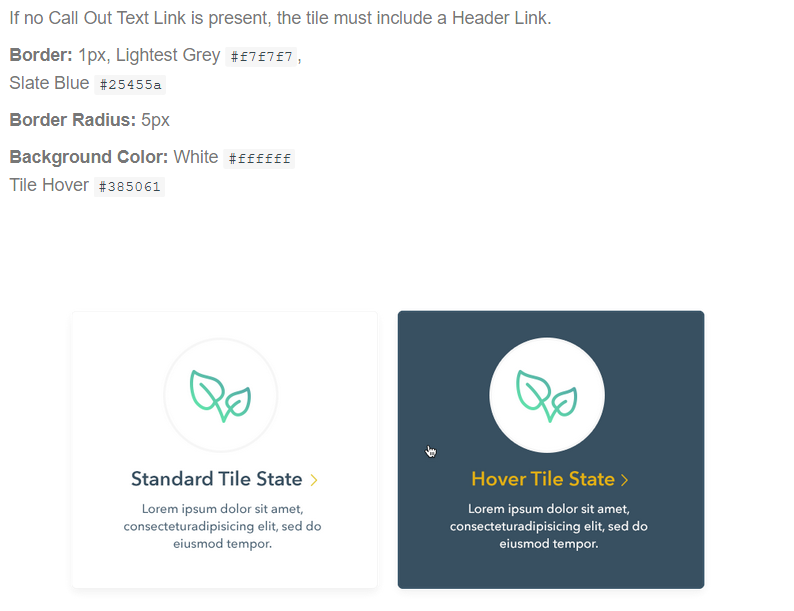
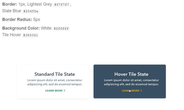
Standard Tiles come in a variety of dimensions and arrangements but by and large always interact the same way. Each Standard Tile is a single interactive element, and as such has a unified hover state. Standard Tiles can include up to one Call Out Text Link. When hovered over, all text and links on the tile switch to their reversed styling. All links switch to their hover state.
Without Text Link
With Text Link
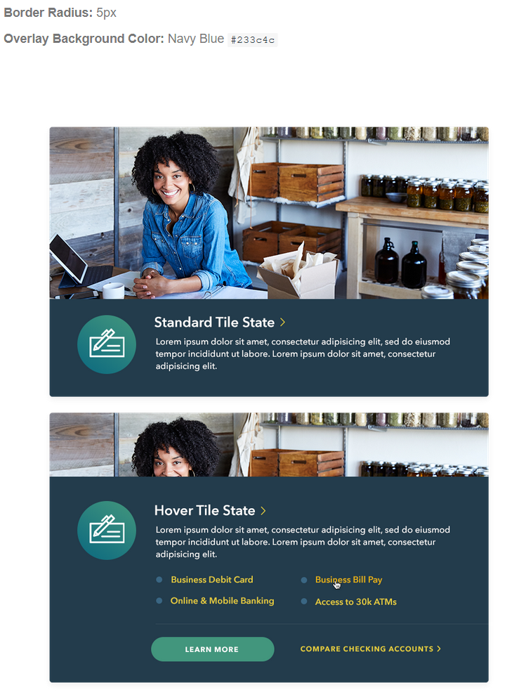
Link Tiles
Link Tiles are reserved for sections of the First PREMIER website such as the Small Business Landing page, where multiple sections of links need to be showcased in a dynamic way. Unlike Standard Tiles, Link Tile hover states reveal a series of links, each of which with their own standard hover treatments. Also unlike Standard Tiles, the overlay animates from one position to the other, instead of switching instantaneously.
Primary Tile
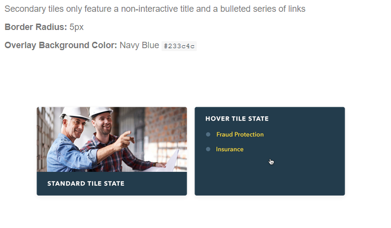
Secondary Tile
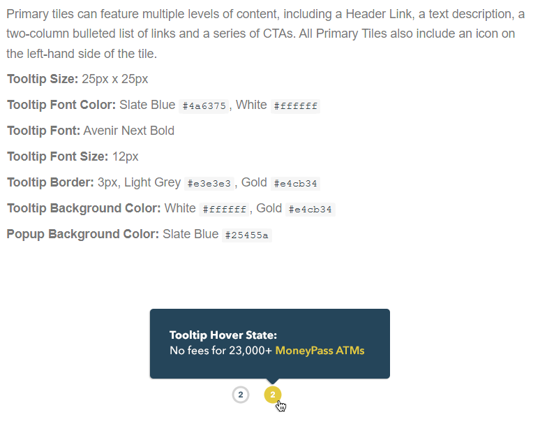
Tooltips
Link Tiles are reserved for sections of the First PREMIER website such as the Small Business Landing page, where multiple sections of links need to be showcased in a dynamic way. Unlike Standard Tiles, Link Tile hover states reveal a series of links, each of which with their own standard hover treatments.
Primary Tile
|