|
Navigation |
Site NavigationThe layout and interaction involved with the various elements of the First PREMIER website's navigation is found here. For more specific detail around graphic styles and dimensions, check the Navigation Template file (PSDs) provided below and in the Resources section. [Navigation Template PSD Download] (file not currently available)
Header NavigationThe Header navigation on the First PREMIER website can be broken into three distinct areas - the Utility Navigation, the Primary Navigation, and the Secondary Navigation. Each area features specific interactions and is built around specific text styles.
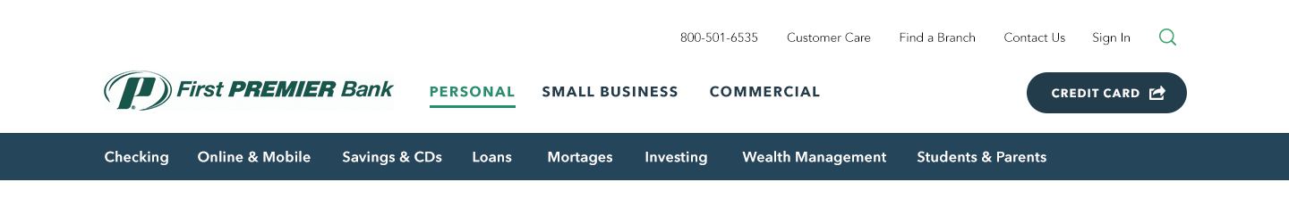
Utility NavigationThe Utility Navigation features links to important pages outside the core content of the First PREMIER web site, as well as contact information and search. Traveling to links featured here has no effect on the content of any other navigation on the site.
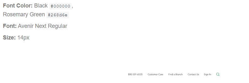
Primary NavigationThe Primary Navigation features the First PREMIER Bank logo, a CTA for the First PREMIER credit card site, as well as the links to each of the three primary sections of the website. Each of the three primary links directs the user to the landing page for that area of the site, while the logo directs the user back to the landing of whatever primary section they are currently in. The credit card site CTA follows the standard design styles for CTAs on the First PREMIER site.
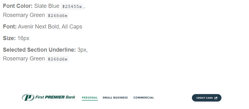
Secondary NavigationThe Secondary Navigation features all of the top-level sections contained within the currently selected primary section. As such, the exact links in this area change when the user navigates between each of the three primary sections. Hovering over any of the Secondary Navigation links brings up the Mega Menu for that section, while clicking on one of the links navigates the user to the landing page for that section.
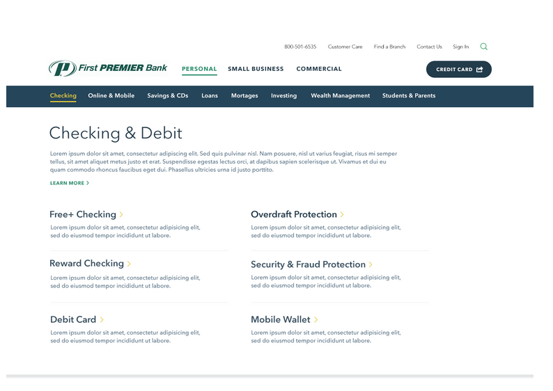
Mega Menu NavigationThe Mega Menu is a full-width dropdown menu that opens whenever a user hovers over a particular link in the Secondary Navigation. It remains open until the user mouses out of the header navigation and menu area. Each Secondary Navigation link features a unique menu, though all of them follow the same format and contain a extended label and description of the selected section with links and descriptions for the various sub-sections therein.
Menu LayoutThe top level section is presented with a Header 2 label, a full column description, and a call out link leading to the section's landing page. The sub-sections are arranged in two columns, with Header 3 links and associated single paragraphs of description. All of the text in the menu follows the styles laid out on the Type Styles and Button & Links pages of this style guide.
Menu Interaction and TransitionsWhen the user mouses over a link in the secondary Navigation, both the underline for the section link and the menu for that section animate in simultaneously. The interactive prototype available at the link below represents an older layout of the menu, but helps to illustrate the interaction and specific timing of the transition. The animation transition is also viewable in the embedded video featured below
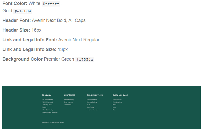
FooterThe Footer is a constant, unchanging presence at the bottom of every First PREMIER website page. It features links for pages outside the core content of the website, including several that are also featured in the Utility Navigation.
Footer LayoutThe Footer content is broken into four columns of links, each with a column header. Beneath the columns is space set aside for various legal text and information.
|